
When I embarked on the journey of designing for Mark Ewen, I took a unique approach. Instead of immediately reaching out to him, I decided to let my designs do the talking. You see, I've never considered myself the best salesman, and I've always found it easier to show what I can do rather than trying to explain it.
To truly understand Mark and craft a concept that resonated with him, I dove into a deep exploration. I scoured interviews, watched countless podcasts and post-fight interviews, and delved into his social media presence. Through this process, several key aspects of Mark's identity emerged, which served as the cornerstone of my creative journey.

First and foremost, Mark's Nigerian heritage was a significant influence. I was inspired by the symbolism found in the Nigerian coat of arms, with its depiction of two rivers merging at Lokoja. This symbolism of unity and the convergence of different paths deeply resonated with me.
Additionally, Mark's burning desire to explore the world through his fighting career stood out. But what intrigued me most was his love for reading. His social media was adorned with books, quotes, and passages. It was evident that he valued mental strength as much as physical prowess.

Armed with these insights, I embarked on a research and discovery phase, eager to infuse these elements into my design.
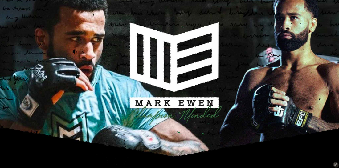
My first goal was to incorporate Mark's Nigerian heritage. I envisioned a design that would subtly nod to this rich cultural background. The idea of the Nigerian coat of arms, with its two rivers meeting, intrigued me. These rivers represented the convergence of different paths—a powerful symbolism especially for someone who is a proud Scotsman but also proud of his Nigerian heritage.
Initially, I aimed to incorporate this concept into the design through wing or arrow motifs, symbolizing Mark's desire to explore the world. However, something remarkable happened during the creative process: the shape I was working on began to resemble an open book. That's when inspiration struck—why not incorporate Mark's initials, M.E., onto the front cover?
The final design, with its open book shape, encapsulates Mark's passion for reading. It serves as a powerful symbol of how he leverages literature as a tool for self-improvement, both inside and outside the cage. The Y-shaped spine pays homage to the Nigerian coat of arms, celebrating unity and the convergence of diverse paths, much like the merging of the Niger and Benue Rivers at Lokoja. The arrow shape signifies movement, mirroring Mark's unwavering desire to keep pushing forward and using his talents to explore the world.
To add the final touch of significance, the colors of the Nigerian flag and the Scottish flag were incorporated into the design, creating a visual link to Mark's heritage and identity.
In essence, this design isn't just a logo; it's a reflection of Mark Ewen's spirit, a symbol of his journey, and a testament to his commitment to growth, both mentally and physically. Looking ahead, I have no doubt that in the years to come, another young fighter will be posting passages from Mark's story because those pages will be worth reading and littered with achievements to inspire the next generation.